Friday 26 September 2014

Finished and Completed Product


1) My Magazine Cover. 


2) My Contents Page.


Editing my Product

1) Below is the first thing I started off with. An A4 sheet of paper and my image. The shot in particular is a medium close-up, centre image. There is lots of room at the top for a masthead and a good amount of space either side of the centre image for cover lines, plugs and etc.


2) The next step was creating my masthead. The picture below shows what I first came up with. "BYTE" was the name I was happy with and I knew I wanted it to be bright and bold, however there was something that didn't look very professional about it.


3)  I had a look online at well-known magazine and noticed that a lot of their mastheads have shadows. So I added a shadow my double clicking the "BYTE" layer on the layer palette and going to "Drop Shadow" where I played around until I had created a shadow I was happy with. The image below shows my new and improved masthead, with a shadow. 


4) The next thing I wanted to add was a plug. I drew a large red circle to the right of my model but again I felt it wasn't enough to just add text and move on. This can be seen below.


5) To increase the attractiveness of my plug I drew another, slightly small circle but this time in black and put it in the centre of the original red circle. The red circle then acted as a boarder and I felt it definitely made my Plug look less ugly. Below this can be seen. 


6) The last step to creating my plug was adding text. I entered the text "WIN AN iPOD" as it was short and I would therefore be able to make it larger in my plug to catch reader's attention. I played around with font and colour and decided to make the text white and in the style of Bauhaus. I then went Edit>Transform>Rotate and rotated the text in conventional plug fashion. The finished plug can be seen below. 


7) The next step was my cover lines. I shall only talk about the editing process of one cover line because the process is obviously very similar for all of them. My first cover line was called "BILL GATES: THE DROPOUT BILLIONAIRE" I inserted a text box and used Copperplate Gothic Bold font and decided upon a size of 18pt. This can be seen below. 


8) Again, I feel this doesn't look very good. It didn't stand out like a real magazine cover-line would so I decided to add a shadow to see the difference. I also moved the cover line from its current place to the left of my central image. This I feel was a triumph and can be seen below. I adopted this for all my cover lines and added shadows to all of them, except half are white and Copperplate but the other half are red and Capharel Pro.


9) Below are all of my cover lines. I edited them in very similar ways to the one above. 


10) The next thing to consider was my sky-line. I didn't want the name of my college magazine to be misleading so I decided upon "Your Personal Bible of All Things Student." It spans from left to right of my masthead. It is Fixedsys font. It can be seen below. 


11) The last things were minor details such as the price and bar-code. I found a picture of a bar-code online and imported it onto my file. The price consists of a small yellow box with text in it that says "£2.99" My finished product can be seen below.


Media Evaluation Questions


What have you learnt from completing this task?


In the space of three weeks I've already learnt so many things about Media from the preliminary task. The thing I consider the most impressive is the skills I have gained with regard to Photoshop. When I started this course I had never used Photoshop before but now I feel relatively confident with it, obviously there are many things I do not yet understand, but I feel I have a strong grasp on basic things.
                Something else I have learnt from this task is about taking photos. I learnt a lot about the wide variety of camera shots in one of Tim’s lessons (high angle, medium close up, etc.) which will obviously be incredibly helpful when it comes to designing my real coursework magazine. I must confess I was slightly naïve when I took my first five photos for my college magazine, as soon as I attempted to edit them I ran into so many problems. One big problem was that the background was so full of colour it would have been impossible to inset some text without it clashing at some point, which obviously looks bad. Another problem I encounter was that my model was on the left hand side of the photo which eliminated me from writing any cover lines on that side due to colour clashes. However I attempted to take more photos and made me model more central and made sure the background was one colour. I have learnt the importance of getting the right shot.
                I also learnt the importance of semiotics and signifiers often in a text many things we pass of as irrelevant are actually incredibly important. It blew my mind how important small details can be that we just subconsciously overlook.

How have you used technology?


This whole preliminary task would have been impossible without the right technology, from my camera to the editing software. I don’t have the best camera in the world yet because I was taught about shot types, backgrounds and lighting I was able to get the right shot. I was able to experiment with my camera in a range of shot types and backgrounds until I was happy with a shot that would later become my college magazine cover. 
                I have also used the editing software, Photoshop, which is arguably the best of its kind. The past three weeks have been a bit like Photoshop School for me as I have never used to until I started Media. However I feel I know the basic things. I can edit text very well, I can also edit pictures (sort of) as I can scale them, rotate them and etc. The idea of different layers was very confusing at first but I now feel quite confident with them. Obviously I am not a Photoshop master as of yet but I can do basic things relatively well. 
                I did have a blog prior to starting Media so I was already relatively confident with starting a blog and posting things onto it. However perhaps something worth saying is that when I first tried to upload my Photoshop test it would not work and then I realised I had not saved it as  JPEG file which I will try not avoid in the future. 

What Conventions have you used and why? 


1) Masthead - My masthead is the word "BYTE" which I think is short, snappy and catchy. Obviously it is related to computer science which is the main topic of my College Magazine (Win an iPod, Bill Gates, iPhone 6 etc.) However my Magazine focuses on other things to appeal to a wider audience. The word "BYTE" is in block capitals and takes up a large proportion of my page and can therefore not be missed. 

2) Cover Lines - As I said before many cover lines (and the plug) are related to technology; "STUDENTS RATE THE iPHONE 6", "BILL GATES: THE DROPOUT BILLIONAIRE" and "WIN AN iPOD." I feel technology is growing at an immeasurable rate and believe one day computing could potentially be a core subject and that is why a lot of my magazine is dedicated to technology because it applies to not just computing students, but every student. Other cover lines include "2014 RESULTS: THE GOOD THE BAD THE UGLY" I have not used the correct grammar here but the majority of magazine cover lines I looked at did not have much grammar at all so I kept it to a minimal. I feel this is a good cover line because it attracts all students. There is also a cover line called "IMPROVE YOUR LOOK" which hopefully will apply to women as this magazine is a predominantly masculine magazine so the improve your look cover line should attract more female readers. I also have another cover line called "WHAT I DID FOR AN A" which I will leave to the imagination but hopefully its provocative implications will attract more readers. My final cover line is "BYTE'S REVISION TIPS" which again, applies to all students.

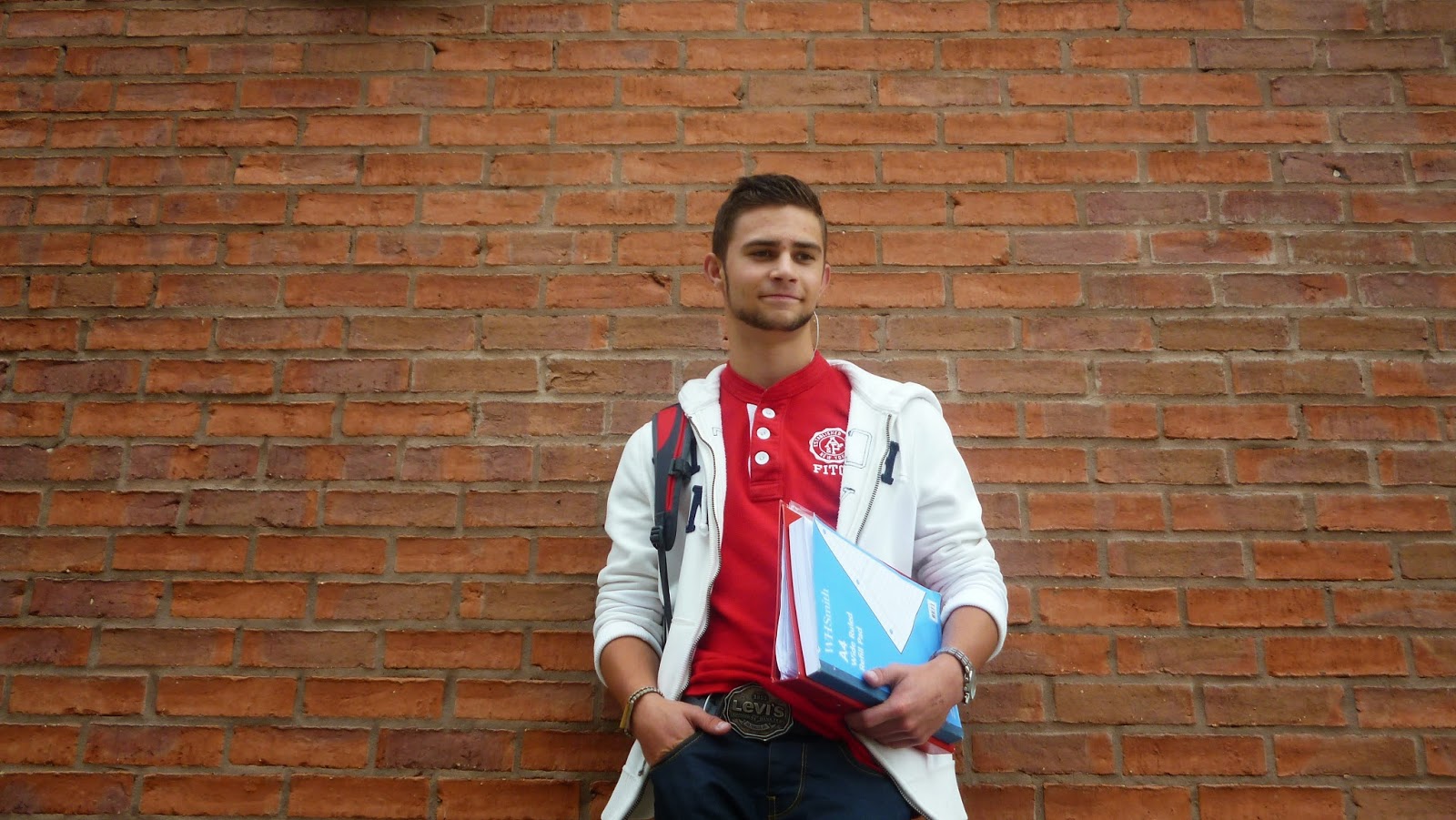
3) The Central Image - The central image is of my friend Ross who dressed smartly, appropriately and perhaps even 'coolly' which applies to the small fashion side of the magazine, but he also has a rucksack strap on his shoulder which suggests he is carrying books and work which shows he is a successful and hard working student. Obviously there is a folder and a pad in his hand which again has similar implications to the rucksack that he is smart and cares deeply about his learning. 

4) Layout and Design - Most college magazines I looked at stuck to a colour scheme, mine is red, white and black. I feel these colours compliment each other very well. The white lightens the magazine and makes it seem believable as a college magazine but the red and black suggest it's edgy and can be slightly cool. Most college magazines I looked at had a central image and cover lines either side of him/her which I have done. There is a small bar-code and price in the bottom right corner, a large and 'in your face' masthead and also a sky-line. 

5) Sky-Line - To avoid any confusion over what type of magazine this is I have demonstrated through my sky-line it isn't just a computing magazine but a college magazine that has something for everyone. "Your personal Bible of All things Student" I feel communicated this well.


What Would you change if your were to do this again?


One thing I would change about this task is the amount of time I dedicated to it. Three weeks is a small amount of time, I feel, to complete this whole preliminary task up to a very good standard. I feel my magazine and contents page were of a relatively good standard but everything else I feel is slightly rushed, not because I didn't spend enough time on everything, but because three weeks is simply not enough.
         I would also change my attitude towards magazines. I started this process wanting to create something different and edgy but the more I tried to think outside the box, the worse my magazine looked. However I discovered that when I stuck to traditional conventions and traditional magazine layouts it started to look a lot better. I can't say why, but if magazines don't look like every other magazine they are simply not appealing. I have tried to follow the rules of magazine making but have also hopefully created something unique too. 


Thursday 25 September 2014

The Importance of Semiotics/Signifies Signified. 

Here is a poster advertising  the 2003 film Pirates of the Caribbean: The Curse of the Black Pearl.


The first thing the audience sees when they look at this poster is the actors faces. All four actors are looking directly into the camera in an inviting fashion. The audience almost wants to be taken into this fictional pirate world and go on a journey with these ferocious and heroic pirates. 
    
Johnny Depp (Captain Jack Sparrow) is wearing a red bandanna and is holding a pistol in one hand and a sword in the other, both cross over making a 'V' shape with his face in the middle. The connotations of this are danger and violence. Red is associated with blood and death which demonstrates this isn't a typical Disney production. 

Above the parchment are the main four actors names (Johnny Depp, Geoffrey Rush, Orlando Bloom and finally Keira Knightley), however the real shots of the actors/characters are not organised in this way. Unlike the writing the images are different sizes and in a different order. Johnny Depp is at the front and is the largest image, to the left and right of him are Bloom and Rush who are both similar sizes and last to the left of Bloom is Knightley who is the smallest. The reason they are organised this way is down to character importance and likewise with their acting names at the top. Depp, the most important character, is the biggest and Knightley, the least important character is the smallest. 

Underneath the actors there is a long shot of a dark pirate ship with a very orange moon in the background. The connotations of this remind me of Halloween because of the orange and black colours. Certain themes of Halloween include pirates and dead men (skeletons) which could be perceived as foreshadowing for the events in the film. 


  Here are another five potential cover photos. They were not used in the end for numerous reasons. In one for example he is blinking, in others he is not looking into the camera or smiling. I tried to use a range of camera shots including a high angle shot and a shot taken from the right.


Thursday 18 September 2014

 Potential Cover Photos

The following five photos are the first initial photos I took for the front cover of my college magazine. For numerous reasons I have decided not to use these photos. The first reason is that not all of them are medium close ups and though this problem could be solved with simple cropping and scaling I do not want to lose any quality. Also the white area (sky) at the top of all these photos is not large enough for my masthead without it clashing with the trees. Another reason I do not want any of these photos as my cover photo is because I want cover-lines at the right and left as it is more traditional yet my model is very much on the left hand side and so writing cover lines would not look very attractive as they would clash with him. Ideally I need to take a medium close-up with a background of one main colour and the model should be centered so I can fit cover lines either side of him. 


Wednesday 17 September 2014

College Magazine Cover Analysis (2/3)

1) Masthead - At the top of the page in block capitals, bright blue writing and takes up about 1/7 of the whole page so cannot be missed.

2) Cover Line(s)

  • "Not exactly extra credit: I SLEPT WITH MY PROFESSOR"
  • "Should I Break Up...WITH MY MAJOR?"
  • "CAREER FAIR DO'S AND DON'TS"
  • IT'S ALWAYS SUNNY IN PHILADELPHIA"
  • MIKE POSNER IS COOLER THAN YOU"
  • CELEBRATING THE BIG 2-1 IN VEGAS"
  • TEXAS LAST NIGHT"
3) The Central Image - The person in the centre, supposedly Mike Posner, looks to be very cool indeed, but also like a well educated man who is read to learn but also keeps himself in shape. I feel this image will apply to many readers.

4) Layout and Design - Much like most magazines the layout follows a set of rules. The masthead is either to the left or in this case central (Because it spans the whole width of the page) and is very bright and bold. The cover image is in the centre and he is wearing dark clothes that will not clash with the cover lines. The background is also a dark colour. The cover lines stick to a colour scheme of light blue and a dirty orange colour, the colours go well together. There is also a bar-code, a date and the edition. 
College Magazine Cover Analysis (3/3)

1) Masthead - "COLLEGE" It is big, bright and in block capitals. It spans from left to right of the page, is very dominant and cannot be missed.

2) Cover Line(s)

  • "A NEW KIND OF BALANCING ACT"
  • "SMOKING SALIVA?"
  • "TUCKER MAX"
  • "SHE'S 15 & PREGNANT" 
  • "AVOID SLEEPING YOUR WAY TO THE TOP"
All are very eye catching and apply to different sets of college students which will attract a wide variety of readers and therefore buyers. 

3) The Central Image -  A young and successful looking student. She is dressed in an attractive fashion which may encourage people to buy but she is also smiling like she is pleased with herself. There is lots of greenery behind her which suggests she is outside, perhaps on a campus basking in the sun and enjoying her studies. 

4) Layout and Design - Much like other magazines, there is a strict colour scheme of blue and black which compliment each other well. The font is the same style but is sometimes in different sizes and some is in block capitals and other is not. Certain text is in italic. There is a bar-code, an edition and a date. This looks like a magazine people want to buy. 
College Magazine Cover Analysis (1/3)

1) Masthead - The "COLLEGE" masthead is in bright, block capitals and definitely stands out. Despite some of the masthead being covered by the student we can still make out what the word says and even if some people didn't know what the word was they would probably know from buying other issues. It also suggests that the person on the cover is more important than the magazine itself. It's a technique that Rolling Stone Magazine often uses. The background is mainly black or dark grey which makes the green masthead stand out substantially.

2) Cover Line(s) - The main cover line says 'Dancehall's Bright Future.' It is the biggest cover line with regard to font which suggest 'Dancehall' is the person on the cover. Because the reader has a visual representation of 'Dancehall' and they know the article is about him they will feel compelled to read it. He looks polite and the "Law" and "Society" books in his hand suggest he's going to be successful. However the cross around his neck isn't something someone would associate with a student because it is very big and 'blingy.' This suggests to the reader he is a person that hasn't come from means or wealth and is working for his success hence "Bright Future" This will definitely make the reader compelled to read the article because many people enjoy an underdog story.

The second cover line says "Why We Love Blackberry" and when this magazine was published was when Blackberry phones were on the rise with regard to popularity and sales, as oppose to today were Blackberry is not very popular at all. This cover line is trying to apply to technology, computing and IT students in an attempt to sell more magazines to a wider variety of students.

Another cover-line says "Make Money On Campus" which as oppose to the previous cover line, applies to every student. Money is a very important issue to all students because it is something they need. Many students find themselves having great difficulty with regard to money because they have to pay fees, buy equipment and revision materials and etc. Most students probably find they don't have a lot of money and so to make money on campus, a place where they usually find themselves, is probably very intriguing to them and will definitely persuade some people to buy this magazine.


3) The Central Image - The centrel image is of a relatively well-dressed ethnic student who looks to be around 17-21. As I mentioned before the cross around his neck suggests he does not come from means and is climbing his way up a ladder of success. The fact he is ethnic might also suggest this too as many ethnic minorities are disadvantaged in some way yet he is still trying to be successful. It will make the reader feel emotionally obliged to read his story (and therefore buy the magazine) He is also smiling which suggests he is a nice person, which again will persuade a person to read his story.

4) Layout and Design - The Majority of cover lines are on the outside of the magazine and mainly do not cover the the central image which makes him the main focus of peoples attention. There is a bar-code on the bottom left-hand corner and a plug next to the students' right shoulder titled "SPLAT" which is probably some kind of competition or activity. The main colour schemes are black, white and sort of off-green colour. They all compliment each other, especially the green masthead on a black background.

Tuesday 16 September 2014

Framing Images


1) Extreme Close Up


2) Close Up


3) Medium Close Up


4) Long Shot


5) High Angle


6) Low Angle


7) Two Shot


8) Image Framed to The Left


9) Imagine Framed to The Right


10) Central Image


Friday 12 September 2014

Researching My College Magazine

Name Ideas: 

  • Kilobyte
  • Megabyte
  • Terabyte
  • Gigabye
  • College Weekly
  • College Times
  • Student Life
  • Freshers Magazine
  • Fresh
  • A Star
  • Study Weekly

Colour schemes:

  • Orange, Red and Black
  • Orange, Red and Yellow
  • White, Red and Blue
  • Blue and White
  • Red and Blue
  • Red, Crimson and Burgundy
  • Crimson and Black
  • Purple and Dark Blue

Feature Story Ideas:

  • Because it's more of a tech-magazine as well as a student magazine perhaps talk about Steve Jobs or Bill Gates as a cover story
  • Definitely mention the new iPhone as that would be quite a big story.
  • Maybe cover line about the lengths some people go to to get good grades
  • Maybe a story about the best and worst courses to talk, maybe a UCAS cover story
  • A cover story about results and grades and what to expect
  • The highest ranking Head Techers/Principals perhaps. 

Examples of Camera Flamings:

Here is a potential high angle shot
 Here is a low angle shot.
 This image is framed to the left.
 This is a very central image.
This image is taken from the right. 

Researching My College Magazine

Mood Board


Wednesday 10 September 2014

Finished Photoshop Test

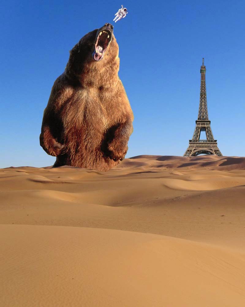
Here is my completed photoshop test. It features a sand dune, the Eiffel Tower, a bear and a tiny astronaut.

The first step to creating this masterpiece was understanding the different layers. There are four main layers to my creation. Layer 1 is my sand dune, Layer 2 is the Eiffel Tower, Layer 3 is my Astronaut and Layer 4 is the bear. The order of the layers on the layer palette is very important. If my bear (for example) was above the astronaut, when I move the bear onto the astronaut it would cover it and vice versa.

Cutting an image is perhaps the most important part of this particular picture. I used the Polygonal Lasso Tool which allowed me to be as precise I had the patience to be. With the eiffel tower I was able to remove the background in one go, however for more complex images such as the bear I removed small chunks at a time to avoid error.

Another important aspect of creating a picture out of different pictures is the colouring. Everything needs to look in place, as it where. To edit an image colour I would go Image>Adjustments>Levels and for saturation I do the same but instead of levels I press Hue/Saturation.

Resizing an image is also very important. To do this I simply go Edit>Transform>Scale. And I do the same to rotate an image except I press Rotate as oppose to Scale.

I feel these were all the main aspects of creating the above picture. 

Tuesday 9 September 2014

Preliminary Task


Brief - To design a college magazine front cover and mock up contents page. Images used on the front cover must be original. (Taken by you)

Your preliminary task counts towards your course-work. If this task is incomplete you lose 20% towards your overall grade therefore it is vital you complete this task to the best of your ability.